Current vs Previous Months’ Daily Cost Trend
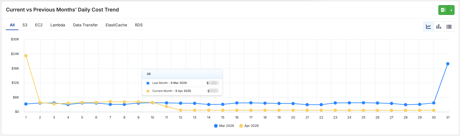
This section provides a day-by-day comparison of cloud spend between the current and previous month, helping users track cost patterns and identify anomalies over time. The visualization displays a line graph of daily spend, allowing users to compare how costs are trending across two consecutive months.
What You See
- A graph representing daily cloud spend
- Two trend lines:
- Current Month
- Previous Month
- X-axis representing days of the month
- Y-axis representing cost values
- Service filters (e.g., S3, EC2, Lambda, etc.) to refine the view
- Option to switch among line, chart and table view
How to Use
- Compare daily cost trends between months
- Identify spikes or unusual variations in spend
- Use service filters to analyze trends for specific services
Key Insights
- Enables early detection of cost anomalies
- Helps track whether spending is increasing or decreasing
- Useful for validating optimization efforts across time