Data Transfer Hourly Dashboard
The Data Transfer Hourly Dashboard provides a detailed, hour-by-hour view of your data transfer costs and usage trends. It helps you analyze per-day cost fluctuations, identify peak periods, and find opportunities for cost optimization.
The Dashboard empowers you to track fine-grained cost patterns, monitor data movement trends, and identify optimization opportunities. Leveraging these insights, your teams can reduce unnecessary transfers and achieve better cost efficiency.
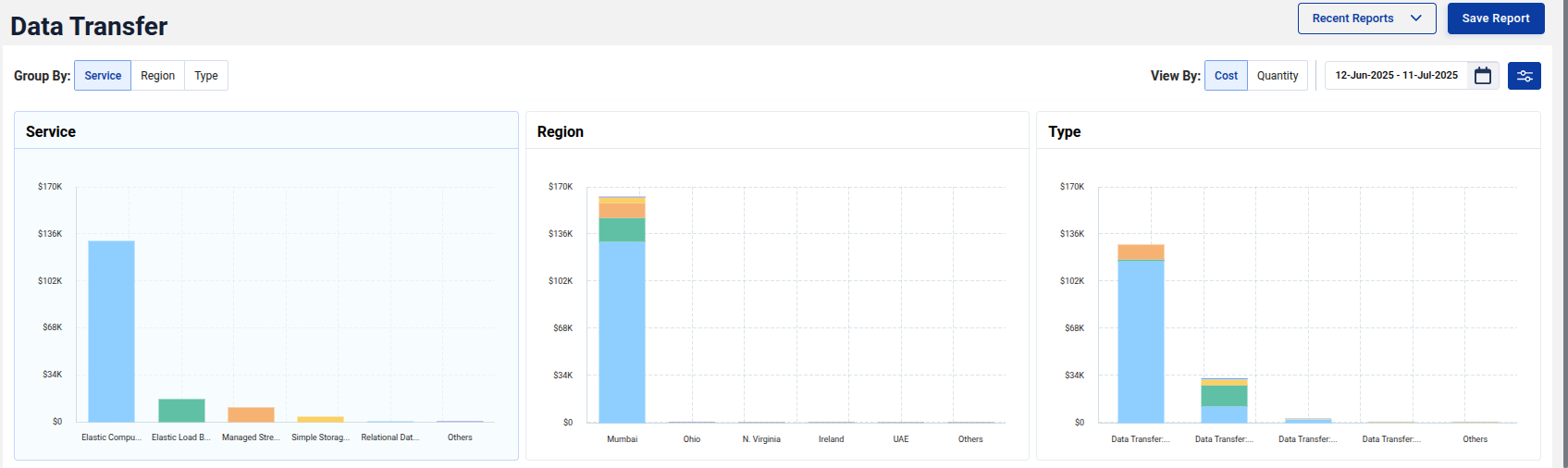
Overview and Filters
At the top, you can group data transfer costs by:
- Service
- Region
- Type
You can also toggle between Cost and Quantity views, depending on whether you want to analyze dollars spent or actual data transferred.
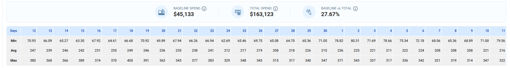
Cost Metrics
-
Baseline Spend: Represents the minimum possible data transfer cost for the selected period, calculated using your lowest observed hourly spend × total hours. It reflects your steady, recurring data transfer activity, the cost incurred even when network usage is at its lowest. This spend highlights your baseline data movement and serves as a safe reference point for identifying consistent, unavoidable transfer costs.
-
Total Spend: Shows the actual data transfer cost incurred during the selected timeframe, combining all transfer types (e.g., inter-region, cross-AZ, internet egress, etc.) and pricing tiers. In simple terms, this is your total AWS data transfer bill, the complete cost of all data moved during the analysis period.
-
Baseline vs Total: Indicates the percentage of Total Spend represented by Baseline Spend, showing how much of your transfer cost is steady versus variable.
These metrics help you assess efficiency and identify areas with high potential for savings.
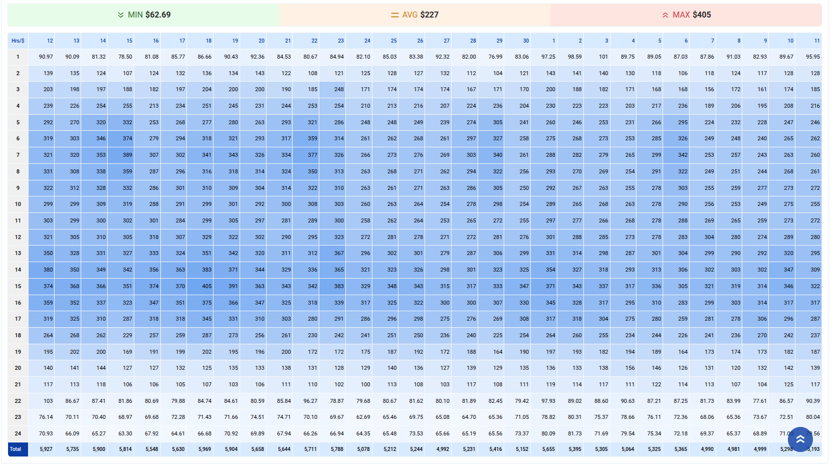
Heatmap Insights
The heatmap offers a visual representation of hourly cost trends throughout the month.
- Highlights peak transfer hours and low-cost periods.
- Color intensity indicates higher costs or higher transfer volumes.
- Helps understand workloads, migrations, or periodic spikes.
Detailed Hourly View
Below the heatmap, a detailed hourly cost grid helps you drill down further to see precise spend patterns.
- Spot unexpected spikes in certain hours.
- Identify consistent baseline activities.
Save and Load Reports
You can apply specific filters, save these views as reports, and load them later for ongoing analysis or team reviews. This feature supports continuous cost monitoring and data-driven decision-making.